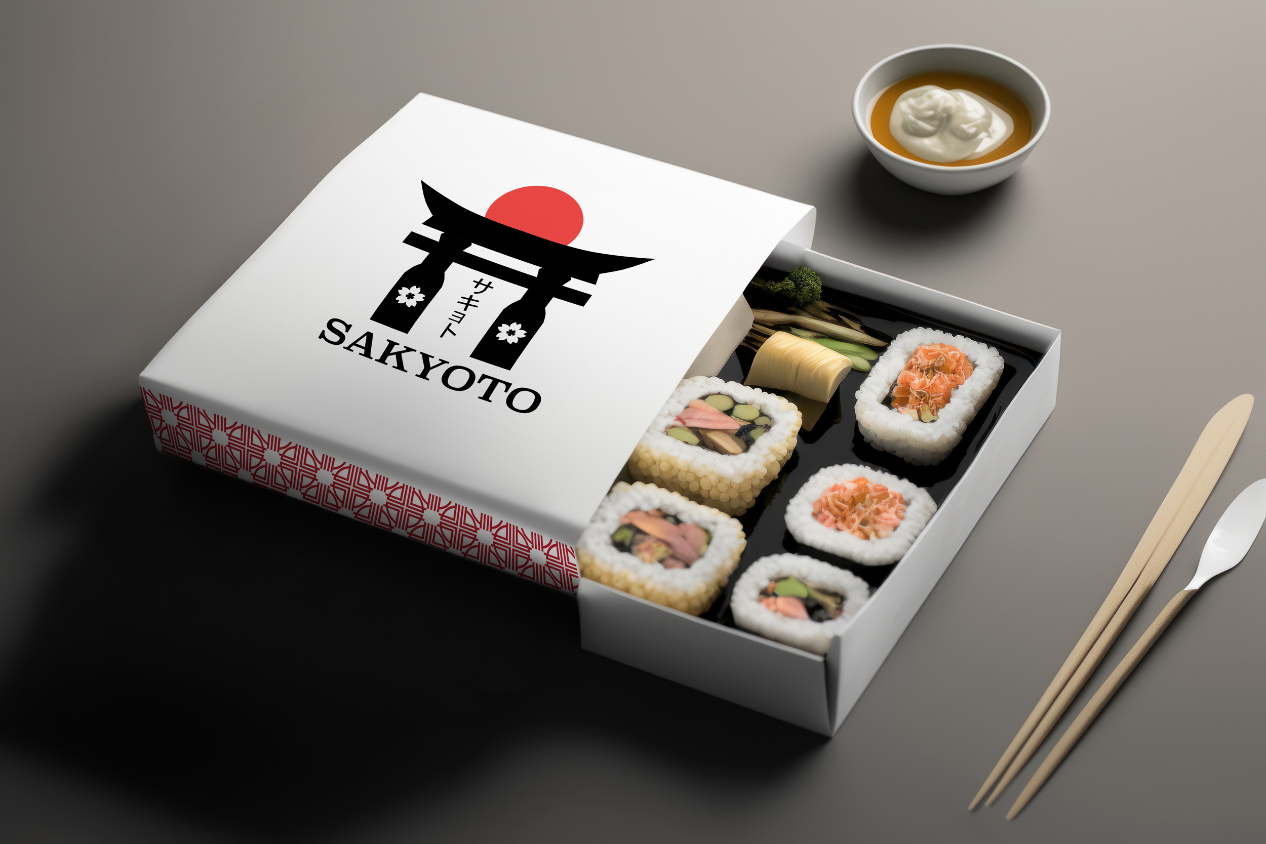
Welcome to Sakyoto. The restaurant project I designed for my Branding class in the Fall of 2024. It is a Japanese-themed restaurant that was created to show the culture and traditions of Japan.
Inspirations

My inspiration for creating this brand was my desire to go to Japan. A long time ago, I always wanted to go to Japan when I was young, but I never got the chance because international travel was very expensive else were very expensive. I see many photos and videos about the culture and life in Japan. It is an amazing country where many people work hard and keep their old traditions alive.
Logo

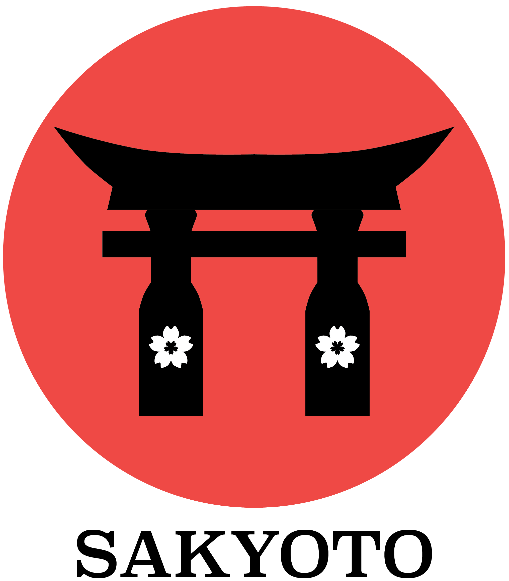
The title, Sakyoto is a combination of the two Japanese words Sakura and Kyoto. For the logo designs, I created various types of logos but I chose to design the logo with a ate with a red circle that represents the Japan’s flag. The design of the gate is a silhouette of it with two sake bottles acting as stilts and a symbol of a sakura flower placed on each of them. The first one has the kanji name, Sakyoto.

Patterns


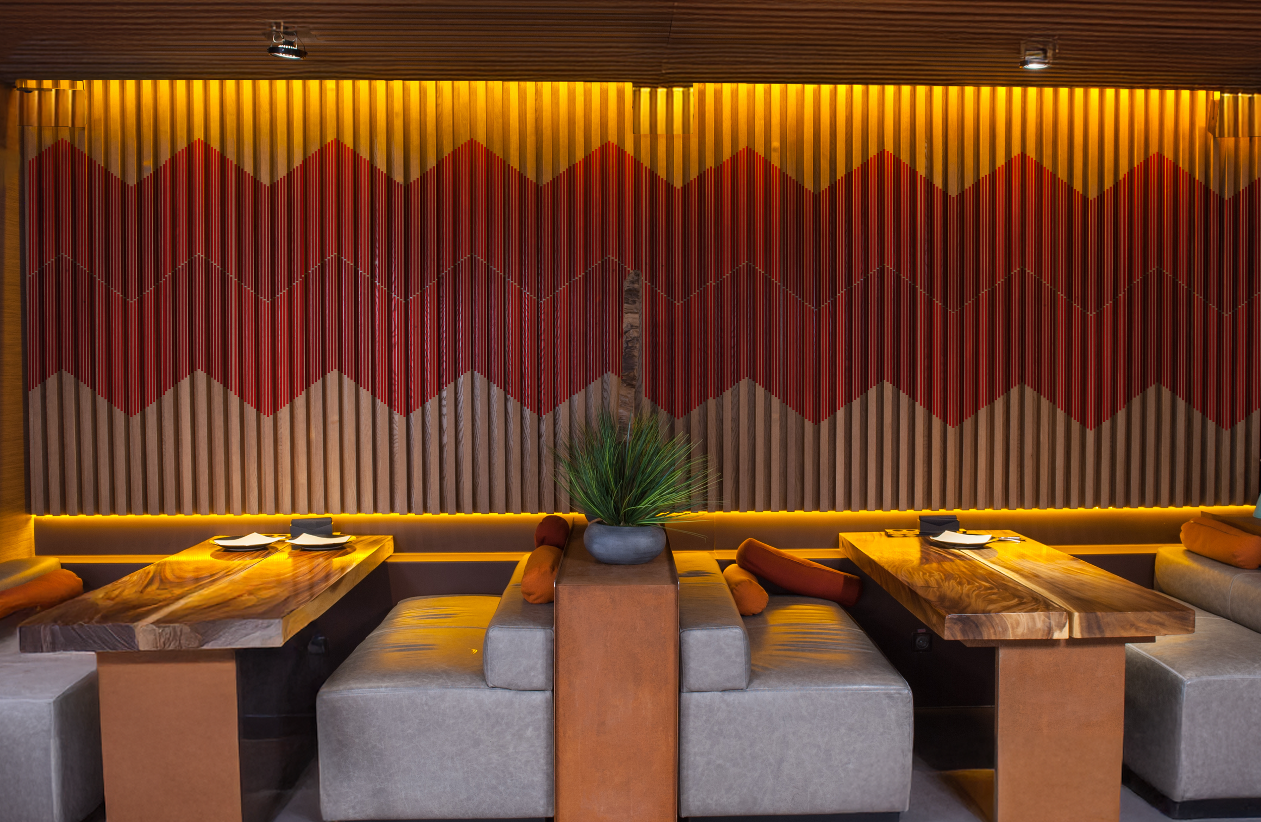
My pattern designs are based on Japanese patterns. I worked very hard to create the patterns and make them almost like to the ones in Japanese culture. The one on the left was the first design of the patterns I used a lot, but I soon changed it to the second one as it seems more custom to Japanese or Chinese style.

Before making my restaurant, I made a style tile to see which colors, fonts, and pattern designs I would use for Sakyoto. For the colors, I chose two different shades of red for my patterns. The dark gray was for the background color of the deliverable products. The black was used for my logo color.
The 3 fonts were my personal choices but I selected Superclaredon for the name cover and kefa for the text on the menu.
The images show the type of pattern design for my project. The sakura symbol was used as part of my logo design while the other three were used for my patterns.